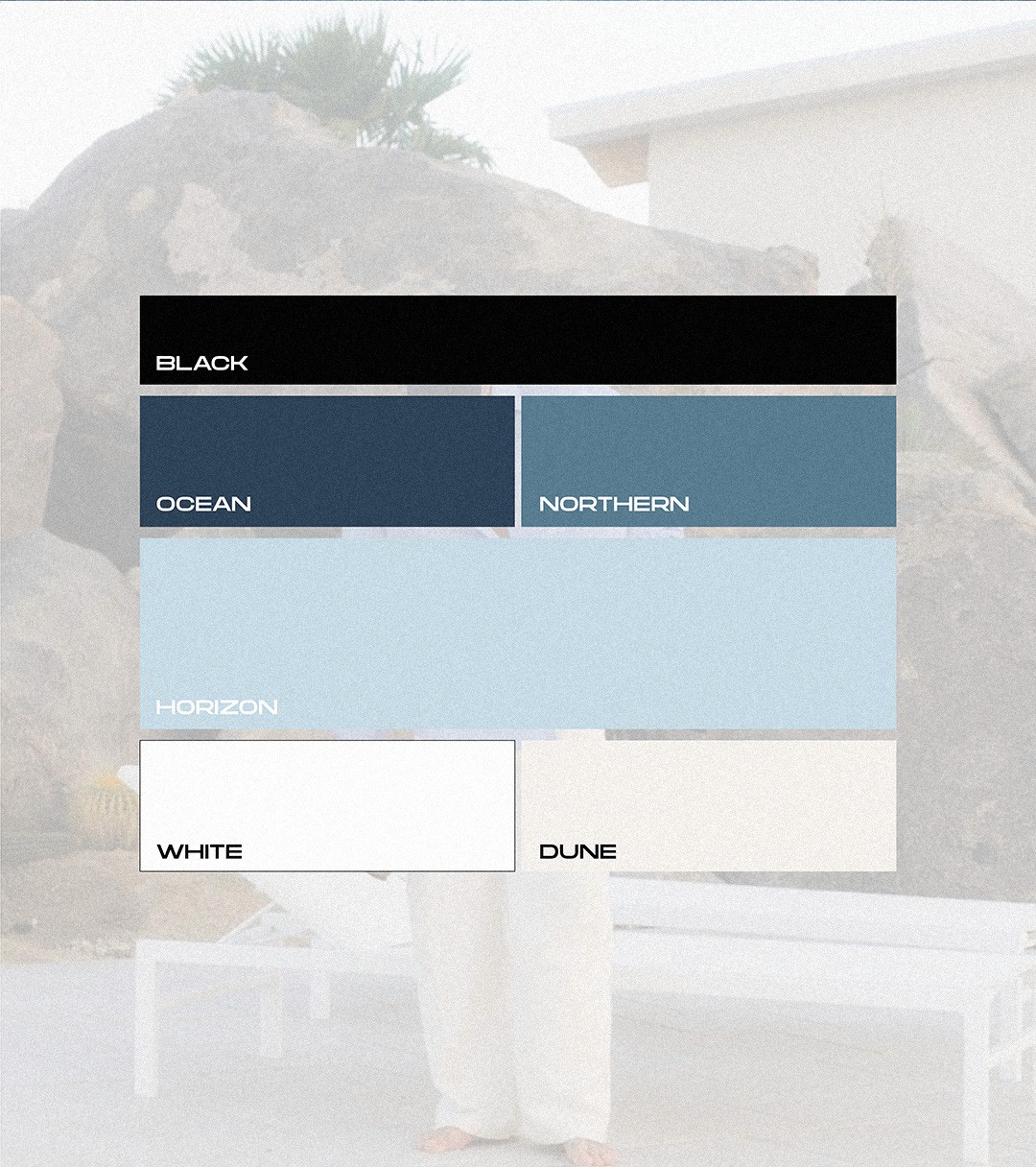
The color palette is inspired by the sky, travel and a sense of freedom
It reflects movement through different environments, from deep, grounded tones to open, airy lightness
Black defines structure and presence, while the blue tones add clarity and a refined, modern feel
Light tones like Horizon, White and Dune balance the system and create space, softness and versatility
Depending on the context, the brand can shift between dark and light environments while maintaining a consistent identity
Color combinations should always follow a clear hierarchy and maintain strong contrast
Dark bases create a more powerful and immersive presence, while lighter backgrounds feel more open and minimal
Accent colors should be used deliberately to guide attention, not to dominate
Consistency in combinations ensures a controlled and premium look across all applications