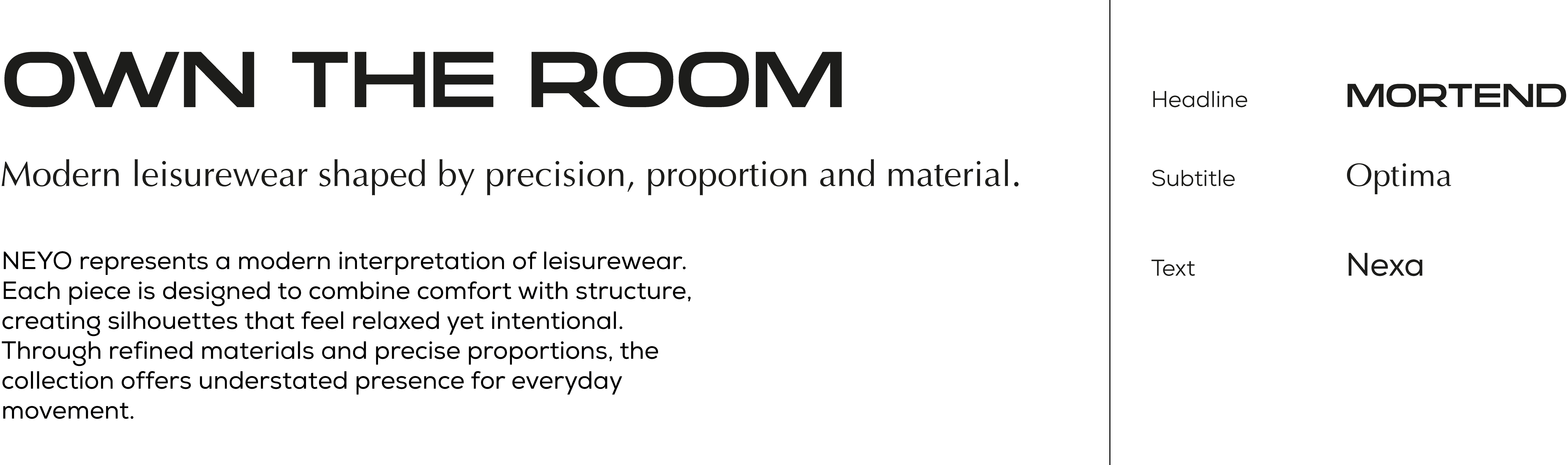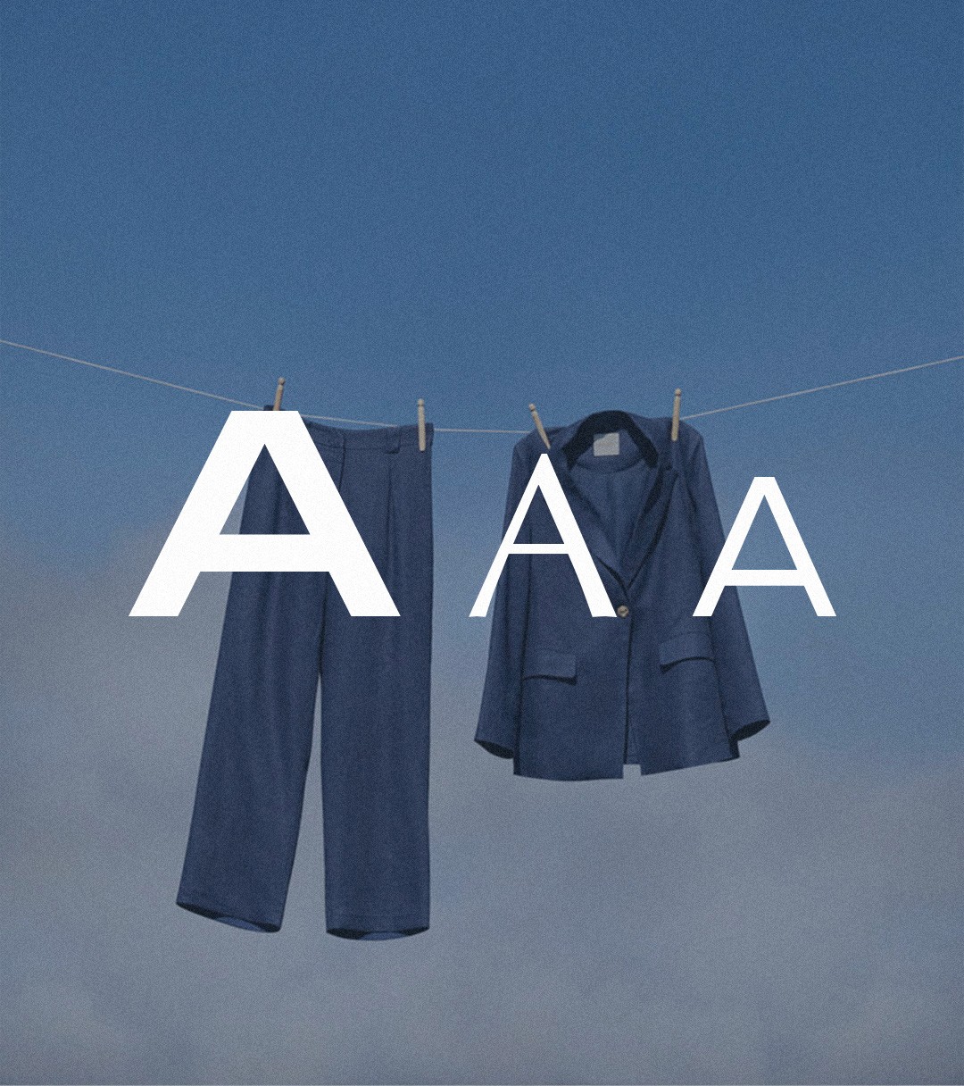
The typography combines precision with subtle contrast to reflect the brand’s balance between structure and ease
The headline typeface brings a strong, modern presence with clean geometry, while the serif subtitle introduces refinement and a softer tone
The body text is designed for clarity and readability, supporting the overall system without drawing unnecessary attention
Together, this combination creates a controlled, elevated hierarchy that feels contemporary, calm and intentionally composed