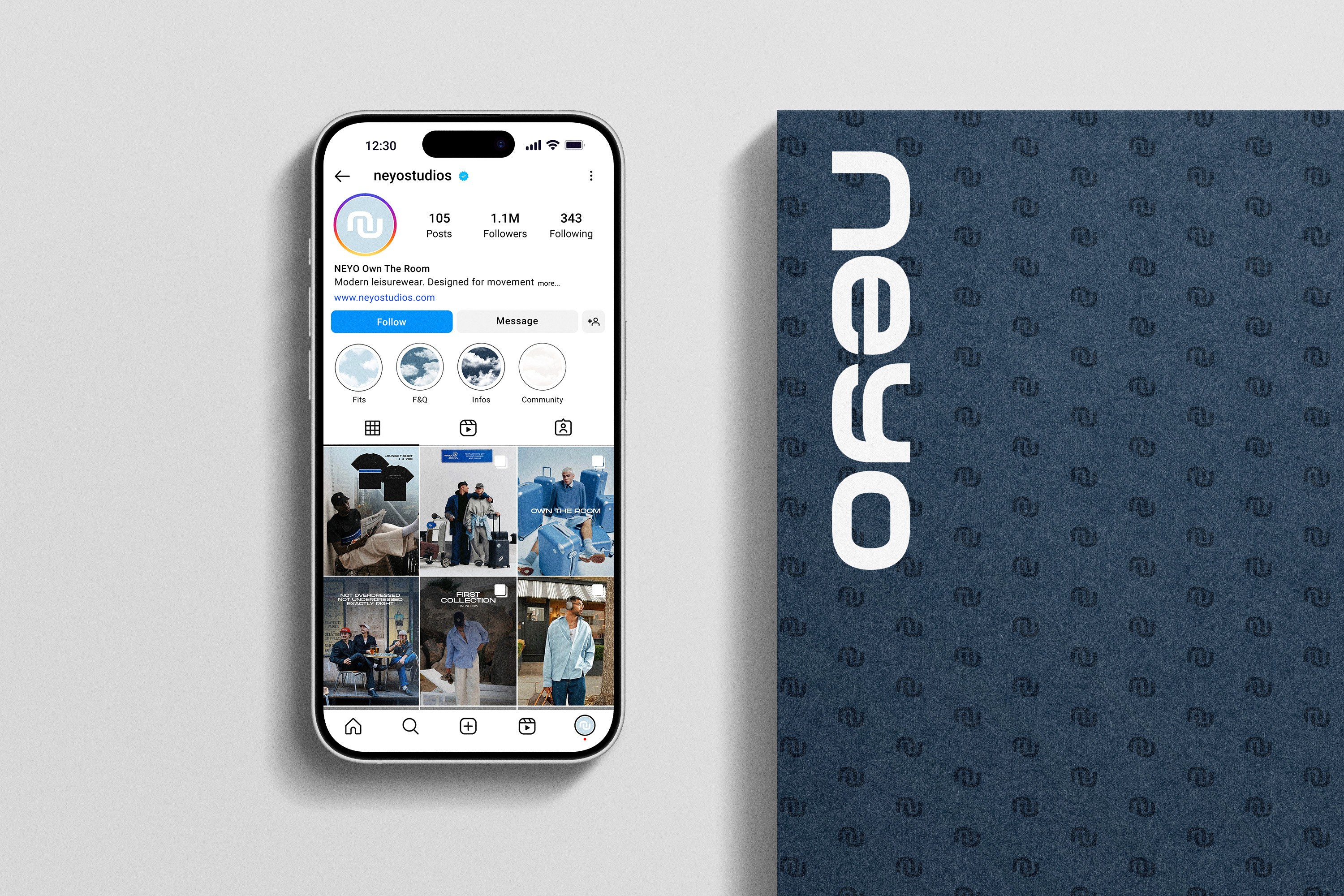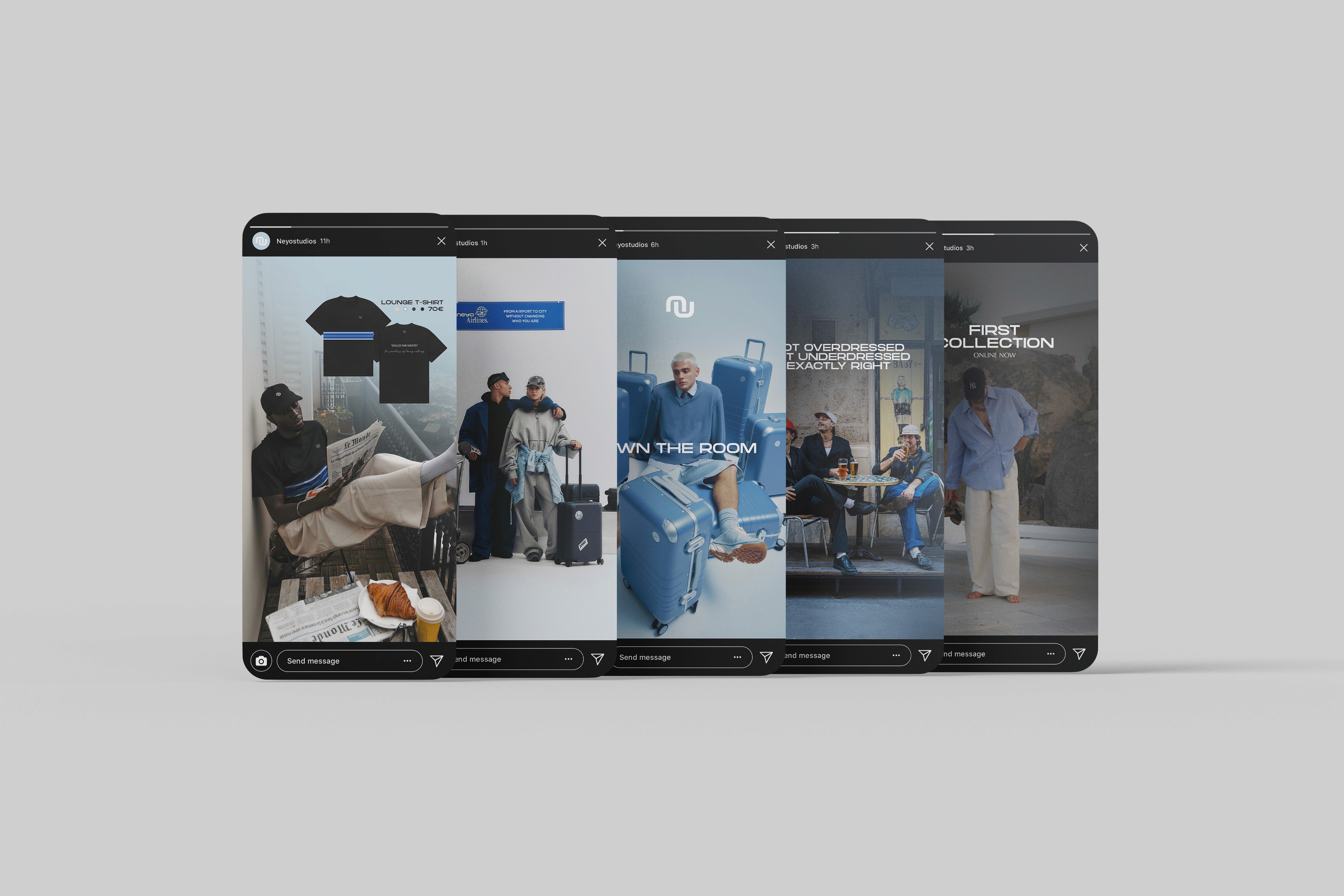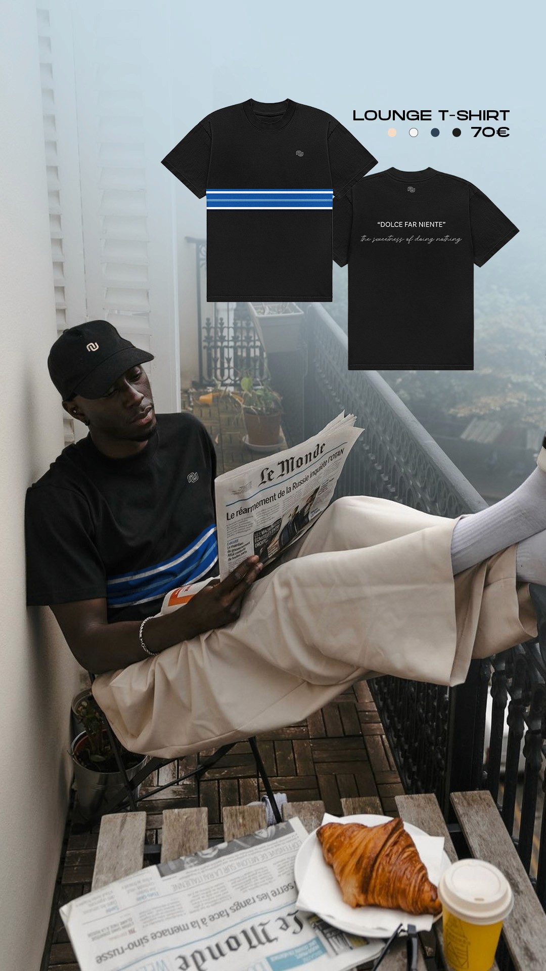
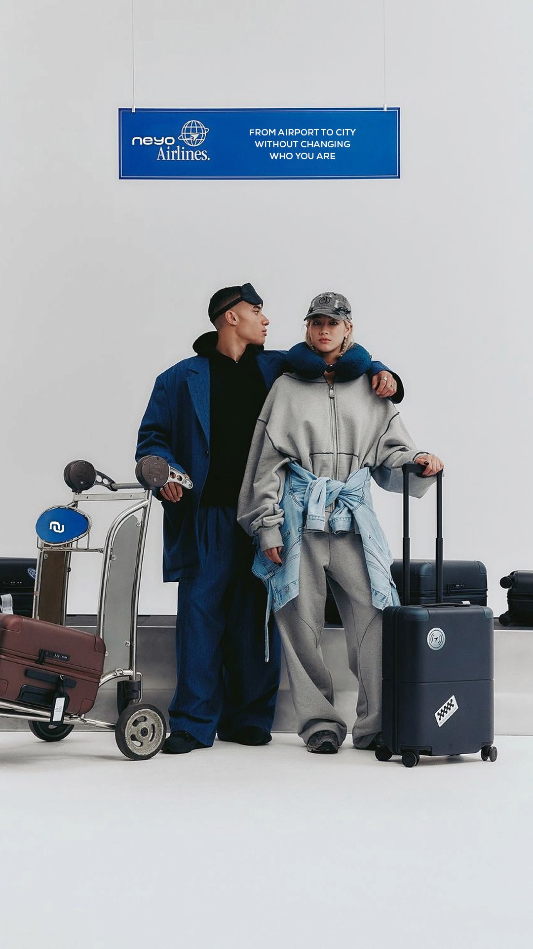

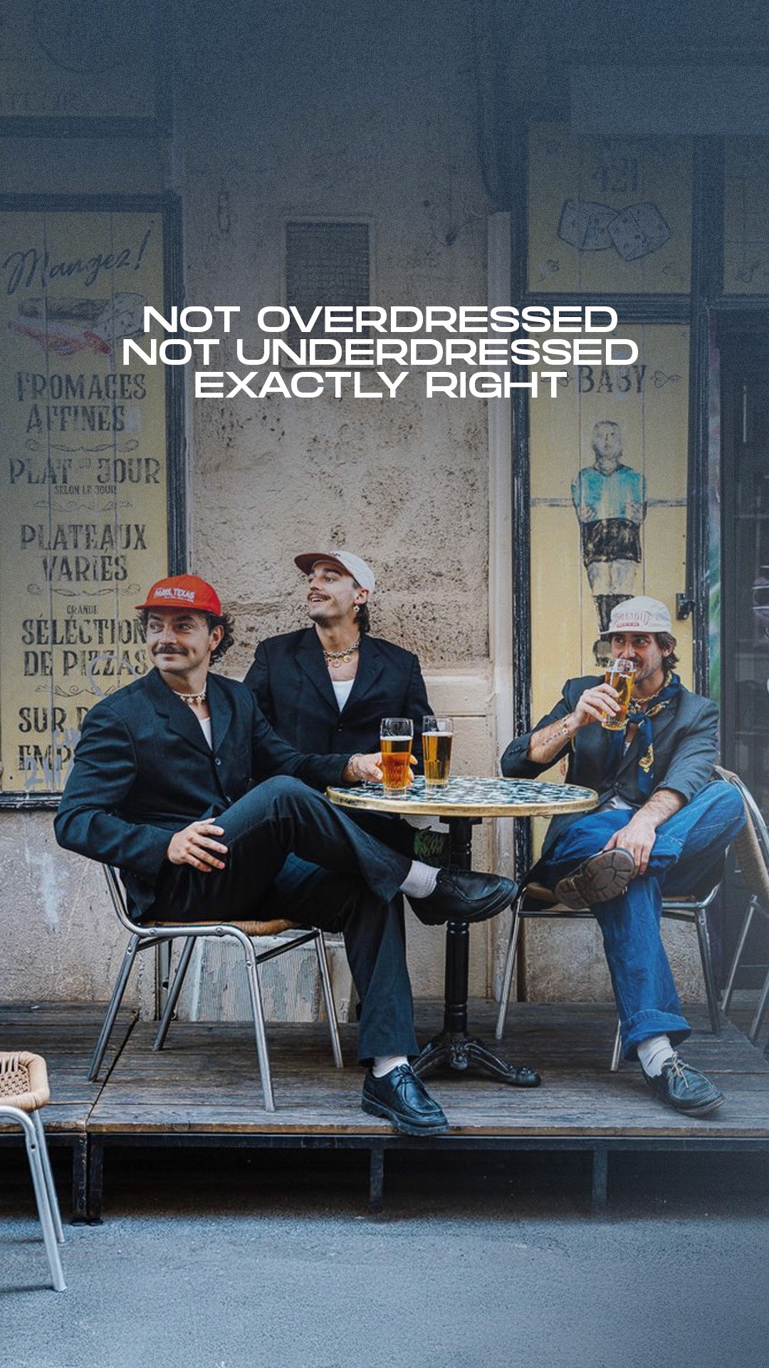

Our social content follows a clear visual language defined by calmness, control and presence. Imagery should feel minimal and intentional, with a strong focus on silhouette, material and atmosphere.
The visual world moves between everyday life and travel. Settings like transit, quiet moments or urban environments reflect the use case of the brand. Styling remains understated and never overloaded, always precise and considered.
Colors follow the brand palette. Cool tones, natural lighting and soft contrasts define the overall mood. Content can shift between darker and lighter executions depending on context, while always maintaining a clean and premium feel.
Typography is used sparingly. Headlines are concise and confident without overpowering the visuals. Text supports the image, not the other way around.
Details matter. Fabrics, textures and construction should be clearly visible, as they are a key part of the brand identity.